The disciplines of customer experience and employee experience wouldn’t exist without access to large amounts of data. That includes, increasingly, the insights generated by artificial intelligence (AI) and machine learning technologies. You can understand more about your customers and your employees through their behaviors, their direct feedback, and the results of their actions, than ever before. But the sheer number of different customer experiences across many touchpoints can lead even the most tenacious CX professionals to throw their hands up, wondering how to measure it all. Your dashboards will help you cut through clutter and tell a unified customer story.
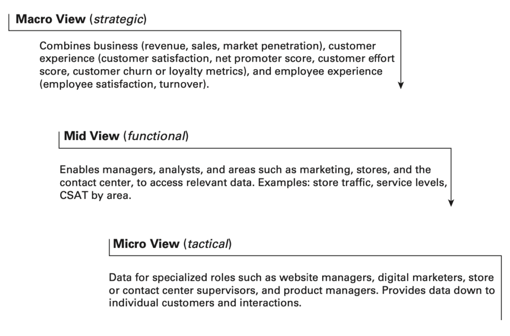
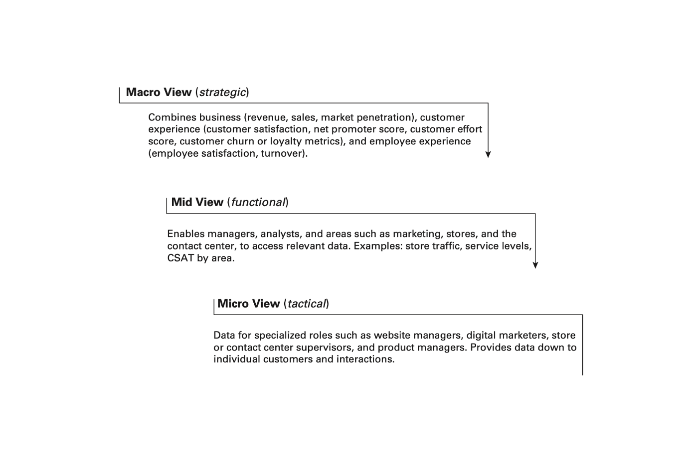
Dashboards are helpful when arranged in a three-layer cascade of detail:
The macro or strategic view: This view combines business (revenue, sales, market penetration), customer experience (customer satisfaction, net promoter score, customer effort score, customer churn or loyalty metrics), and employee experience (employee satisfaction, turnover). It should provide the ability to view data by product, department, or customer segment. This high-level view allows senior-level leaders to keep an eye on overall direction and to check in with managers on specific trends.
Example: Your core CX team reviews last month’s survey feedback on their macro view dashboard. They see CSAT is down noticeably for new customers. They notice that it’s a trend that has been building since the last product release. There have been problems in the past with products launching before they were ready or with delayed documentation. It’s a bit of a sore subject. The team asks the VP of Product to take a look.

The mid or functional view: This view allows managers, analysts, and roles such as marketing, stores, and the contact center, to dive more deeply into relevant data. This enables them to connect the dots between their areas of responsibility and overall strategy.
The VP of Product sighs. She pulls up her dashboard, which also gives her access to voice of the customer (VoC) streams (complaints, escalations, post-call and NPS surveys). She then pulls up the post-call survey data and digs in. What she finds is interesting. When she drills into categorized results, she can see that more complaints were categorized as “feature-complaint.” This is how the team categorizes feedback related to features that work as designed but that the customer doesn’t like or doesn’t understand. The reps in the contact center can help explain it— but by then it’s already disrupted the customer’s business. So, there’s still dissatisfaction.
The micro or tactical view: This view is for specialized roles such as website managers, digital marketers, store or contact center supervisors, and product managers. It provides data down to the individual customer level.
The VP asks a voice of the customer (VoC) analyst to listen to a sample of poorly rated calls and document what he hears. The analyst goes to his VoC dashboard to filter for poorly rated calls tagged “feature-complaint.” He also heads around the corner to the contact center, and checks with some reps. “What are you hearing about the last release?” After listening to calls and talking to reps, the analyst feels confident he found the gap. Many cloud customers were using the new release before the documentation was published. This created misunderstandings about the new features, especially with customers not yet familiar with the product. When the analyst validates this perspective with a team of reps, they emphatically agree. Communication for this release was late and lacking in critical detail.
The VP of Product presents these findings to the CX team, with a plan to improve future customers’ experience. No product releases will be launched without complete documentation published several days ahead. Frontline reps will review the documentation ahead of the release to anticipate customers’ (especially new customers’) questions or concerns.
You get the gist here. This is one of a jillion ways to use a multi-layered, consolidated CX dashboard. And I’d point out the wise decision of the analyst to walk around the corner (or call or video conference) and have conversations with those closest to the issue. Dashboards are important tools, but they don’t replace firsthand experience, wisdom and intuition.

Excerpt from Leading the Customer Experience: How to Chart a Course and Deliver Outstanding Results by Brad Cleveland.


0 Comments